Friday, 16 December 2011

Starting to Edit

During the process of editing of the first footage I filmed, I realised that I may have to re shoot many scenes again. This is down to the lighting not being good and a change of idea. I also didnt complete the filming when I first shot the video due to inconvenience. This meant it was hard to piece the video together for a first edit as there wasnt much to work from and the video that was shot wasnt good quality. However I managed to add a few clips and match it with the music just to get the hang of using the editing technology. I selected the clips that would be good to use in my final video and put them in the order I wanted them.

I also decided I may not re-shoot my footage of the house as it would be too complicated to get the lighting right. So I have decided to change the way my storyboard will go. However I still need to shoot some more footage eg. Woodland/forest scenery.

Edit log so far.

Experimenting

This is the edited version of the same shot. I made the colours
more vibrant so that her hair and grass especially were quite
bold and stood put. I think this effect works quite well.
This is the original shot from the video without any editing. It works ok without an edit but it could be made much better.


The original shot. This could work but is quite plain
and boring so an effect may make it look better.

Added a red effect.
The shot without editing.

No added effect as I think this shot doesnt really need one.
A black and white effect it could work if I was to have
 the full video in this mode.


Brightened the picture and changed the contrast
however the quality and lighting of the photo
could be improved.

This shows some of the footage I filmed but wont be using.
The lighting was bad for this scene so I decided not to include this in my final video.
I decided I shall not be sticking to my storyboard as the lighting didnt work in my video for this scene especially.
The lighting again wasnt as good as it could have been and therefore I shall not include this scene. I could have chose to reshoot the bad lighting footage but decided it would be easier to change what I wanted in the video.
Added a glow to the picture and made the shot brighter.
I like this effect especially for this shot.


People appearing in my music video

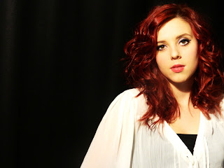
This is a picture of Jess the person who shall be acting as the artist in my video.
Her vibrant bright hair makes a perfect contrast against the mise en scene I am planning to use.
She is confident and willing to perform well in my music video and so is perfect for the role.
She will be performing as the artist 'Allie Roe'.

This is Lily the dog who will also appear in my music video. Getting her to run in my music
video wasnt a hard job but did take time. I wanted to have her appear in the video as it carrys
a good representation and creates quite a loving and calm mood.

Thursday, 8 December 2011

Artist Profile

Name of Artist: ALLIEROE

Genre: INDIE/FOLK

Occupation: SINGER/SONGWRITER

Bio: 19 yearold British singer/songwriter originally from Heresford. Has released 2 albums and has had number 1 hits with 3 of her songs.

Albums: Rocky Road and Starlight

Wednesday, 16 November 2011

Script & shooting scheduale

I have chosen to do my music video as a visual story. The song is about a girl who is willing to do anything she can to keep her partner. As it is called 'The Writer' I have decided to present the artist as 'The Writer'. I will have the artist in the video writing the letter as well as other shots of her. It will be as if the artist is writing the letter and I am showing what she is writing about. She will appear in a happy and comforting place as she is effectively wanting that from him. The ideology will be that she is a strong, dominant female being an individual with a message that states she can be who she wants and her partner should love her for that. This ties in with the lyrics. I will include different destinations prior to the clip and point of the song. I think this will make it more interesting and unique.

Inside the house: Filming (22/11/11)
  • Writing the letter
  • Scenes with dog
  • Lamp shots
  • Bedroom scene
Field scenery: Filming (22/11/11)
  • Dog Running
  • Artist walking Long shot/Mid shot
  • Spinning around
  • Close ups of her face
Woodland scenery: (6/11/11)
  • Laughing near the trees
  • Long shots of artist walking
  • Rotation around the trees
  • Close up leaves and boots
Street scenery: (6/11/11)
  • Tracking the artist walking
  • Swish of her hair in the wind

Audience Research

In order to plan for my music video I have created a questionnaire to gather information from an audience. In this questionnaire I have various questions that are there to find out what music video would interest the audience and if the song I have chosen is the right one.


Name of the artist

Tuesday, 1 November 2011

Initial planning of: Mise-en-scene/Prop List/Cast List/Costume List

Some of the props I could use in my music video are:
  • Leaves
  • Rose Petals
  • Pen
  • Paper/envelope
  • Dog
  • Glass of water
  • Possibly umbrella (if it rains when shooting-it could still work)
  • Mobile phone
  • Bed
Some of the locations that I could use in my music videos are:
  • Woodland
  • River Bank
  • Bedroom
  • Kitchen
  • Street
  • Field
  • Garden
Cast List:
  • Jess- Main Artist
  • Lily- The dog
Costume List:
  • Leopard Print tights
  • High waisted shorts
  • Military boots
  • Leopard print coat
  • Green Maxi Dress
  • Flower accsessory for the hair

Inspiration for mise en scene


This picture highlights the scenery and the model at the same time which is
what I aim to achieve with my music video. The lighting on this picture is what
I hope mine will appear like however this may come with problems as you cant
control what the weather will be like. Also the way the girl is dressed in this
picture is similar to how I want my artist to be dressed.

My artist will have the look of red hair and porclain skin and so this
picture represents that. As I am hoping for a look of scenery in my music
video this picture shows flowers scattered around a girl which inspires my ideas
for my music video. This would be difficult to replicate as the season difference will
cause problems as it will be autumn/winter at the time I will be filming meaning the
flowers will be hard to get a hold of.
This is good mise en scene for my music video as I know trees with autumn leaves
will be available to use as imagery in my video. I aim to have my artist featured round
woodland scenery .
I weill use single shots of leaves as I think they will look effective in my video
it mixes up the video as it doesnt nessacerily focus on the narrative making it more interesting.

Analysis of Lyrics to my chosen song


Tuesday, 25 October 2011

Conventions of a website homepage

  • The artist will appear on the website homepage so the audience are aware they are on the right website for the right person. 
  • The artist's name will be made bold as they are the brand. It will most likely be used more than once.
  • The name will be featured at the top or in the centre depending on the type of hompage. The audience will look here first.
  • Promotional material will be featured on the page. Includes album covers, music videos and fan videos.
  • It will have a menu bar with drop down links to other pages. the menu bar will include the conventional headings that are Home, About, News, Gallery, Video, Tour, Forum, Downloads, Blog, Contact (to name a few)
  • The success of the artist is usually noted.
  • The artist usually has some form of information updated directly from them eg blog, twitter updates.
  • It will feature the artist's logo so the audience can identify them.
  • Different house colours and styles/themes will be used to reflect the genre of the artist.
  • The latest information regarding the artist is usually highlighted for the audience to see. 
  • The record label is usually highlighted along with a legal copyright notice. Usually placed at the bottom of the page. 
  • The audience are usually able to regognise the genre fromhe way it looks as well as the artist representation.
  • Images of the artist as well as there latest music video.

Conventions of a magazine advertisement

  • Band or artist will appear on the advert in some form
  • The artist's name will feature on the advert usually the main attraction
  • The name will be placed at the top of the advert so that the audience will be attracted to it first.
  • The CD cover will also be featured somewhere on the advert. However this isnt always the case.
  • It will have a snappy tag line, such as stating that it's a new album and when its released  (snappy because it appeals to the audience)
  • Quotes will be used from positive reviews/sources. These usually are backed up by a star rating.
  • The name of the album is usually featured next to the artists name.
  • It will feature the artist's logo - people who already know the artist will be able to identify them from this. 
  • Colour schemes don't reflect the magazine's own colour scheme, but the band's or the product's being sold.
  • The artist will be represented in a way that will appeal to the audience and they are able to engage with.
  • Institution logos will be ibluded these could include record label and music shops. Play.com can be seen on many, because it is a popular source for music distribution. This would be situated at the extreme bottom of the page. Another example would include HMV.
  • A release date will also be included on the advertisement

Monday, 24 October 2011

Analysis of magazine advertisement for a digipak


Ellie Goulding is the artist that sings the song 'The Writer' which I am using for my music video. Therefore the advertisement for her is something that can be seen as inspiring to my work as she is potentially the role model of my artist. However I will try to make my artist there self too so that she isn't a copy of Ellie Goulding. Ellie Gouldng is a British Singer/songwriter who has become very successful after winning the critics choice award at the Brit Awards in 2010. Now well known, she is continuously dominating the charts with her many hits that she released over the years.

The point of this advertisement is to make the artist appealing to an audience as well as promoting her music. Highlighting the main successful points of her career so far is something the audience will look at giving the artist the attention she needs to be sucessful. From looking at this you can tell the artist is being represented in a good way as the use of descriptive language in a positive manner is visable. Portraying the artist in a positive way is something the audience will look out for as they are less likely to be drawn to an artist with a bad reputation and little success. The record label of the artist will be doing all they can to make her seem successful as they know this is something that will be looked at. If an artist isnt successful and doesnt have much going for them then audiences arent going to want to know. Magazine journalists from America have commented on her making her look like she is really well known. 'Its hard to crack America in the music industry'- This is something that is often said about British artists and the fact Ellie Goulding has had positive comments shows just how big and powerful she is. She is also dressed quite low key in the image shown, showing that she is possibly quite down to earth and is more about her music than her image which people will identify. The fact she is showing only one side of her face may coonte that she has another side to her the music side and then the real her. It ignites the fact like everybody else she is a real person but just entertains for a living.

The purpose of this media text is to promote the artists album as well as the artist. It is conventionally set out like an advertisement would be, with the main text highlighted as that is the most important message and the artist is on display. The text is making the audience aware of the artist and her music. The purpose of the advertisement is to inform the audience of her music. The institution for this media text is were it is published. Whether its in a magazine or a newspaper they will be the institution. Advertisements are placed in the right kind of magazines in order to target the right audiences. As she is an indie/pop/folk singer you wouldnt expect to find this advertisement in a magazine that didnt reflect the genre as that wouldnt attract the right people meaning she could potentially loosing out on success.


Analysis of website Homepage - Florence and the machine


As I hope to design and create a homepage for my artist I researched one existing one that is for an artist that has a similar look to the model I am using for mine. The artist is Florence and the machine is known to mix up her genres and her sound has been dubbed as indie, rock and soul. She is very successful and her debut album spent more than 2 weeks at number 1. She is fairly popular in the music industry attracting audiences in the age group of generally 15-30.

Florence and the machine the artist is being represented as an individual on this homepage when in fact there are more than one person in this band. However as she is the lead singer the limelight is on her. The representation of her is fairly good. She appears to have an iconic look to her with the porcelain skin and red hair, something which goes back hundreds of years ago. Women in the Elizabethan Era used to have the iconic red hair with really pale skin purposely done as the denotations back then meant that if you looked like this you were wealthy and were high on the social ladder.This image she is carrying connotes that her sound has an edge that could be seen as quite old fashioned as conventionally, sound is represented through image. By this I mean you can tell what genre of music the artist usually is categorised in due to how they appear visually. Also there is only one photo that appears to be on the homepage which is ironically against a black background. This works well as she is pale doesn't blend in with the background. However she is dressed in a black sequined dress which contrasts with the background. To me this suggests that they are only trying to highlight the significance of her unique look taking away the clothing. It doesn't matter what she wears because she is still unique.  Even though she is wearing colours that match the background she is still the main attraction of the site automatically promoting her to the audience.


This picture shows someone from the Elizabethan Era with a
similar image to Florence and the Machine. (Hair and makeup)
Conventionally all website homepages are set out with a home menu bar with drop down bars and pictures. Like many other websites this homepage does the same and has headings that you would associate with music. Some of these are 'Gallery', 'Music', 'Blog' and 'News'. These are links to other webpages that feed information to the audience regarding the artist and is something I will include on my homepage. The purpose of the website as a whole is to promote the artist and there are many things that do this. Album releases, tour dates and blog posts are some of the things that are usually placed on the homepage being the first features the audience will see. Florence and the Machines new album 'Ceromonial' is due for release and so the album is placed on the homepage with a 2nd copy of the main photograph of the artist. Using the same photograph twice suggests to me that this image is a big significance to the album and the audience will automatically relate the album to this image.

From this website you can see that the genre of the artist is indie/rock. The codes of these genres are dark colours with an edgy style which this website shows. Just from how the artist is styled you wouldnt direcetly assume she swas rock due to her conventionally not being dressed in dark colours she is very much the opposite. However she does have the pale skin that bads like 'Kiss' are known for yet they are very much more heavy metal/ hard rock and paint theirs on. Florence may be naturally pale yet her look is unique and appealing to audiences. The person I will be using for my music video will have a similar style to Florence's whic is why I have chosen to look at her website. It is inspiring towards my own work.

The original music video to my chosen song 'The Writer'


This is the orginal video to my chosen song. This music video is more about the artist than the lyrics. She shows herself singing the song aswell as her been shown along side scenery. This is a conventional thing to do due to the genre of the song which is Folktronica. As my music video with be completely orginal it will be different to this one however some elements of this video such as the choice of clothing the artist is wearing and the different shots used would maybe work with mine also. I like the way the artist appears against a white background when miming the lyrics I think it represents her in a way that the audience will get. By this I mean it shows just her singing getting straight to the point nothing else is needed. The ideology behind it shows her as a dominant female expressing her feelings towards something even though the lyrics dont put her in a dominant position stereotypically the male is yet only a female ,being the artist, appears in this video. This may be down to the fact she wants to represent her character as the strong one. In my music video my interpretation of the lyrics will be more straight forward following the narrative and making it fairly obvious to the audience. Showing the story visually makes the them understand what the song is about, this is similar to the music video by Colbie Caillat 'Realize'.


These photos are of Ellie Goulding and inspire the look for my video. These photographs show her in a scenery image, aginst a neutral coloured background and one more casual photo. These are all elements I will include in mine. I think this sort of look represents the genre and goes with the issue of the lyrics. It shows the type of artist also. I want my video to look casual, meaningful as well as telling the story.